Project Analytics
Each project has an analytics section. Depending on how you are using Kanboard, you can see these reports:
User Repartition
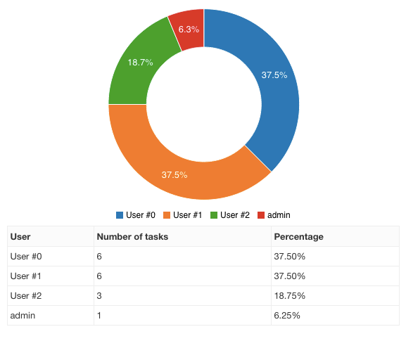
This pie chart shows the number of open tasks assigned to each user.
Task Distribution
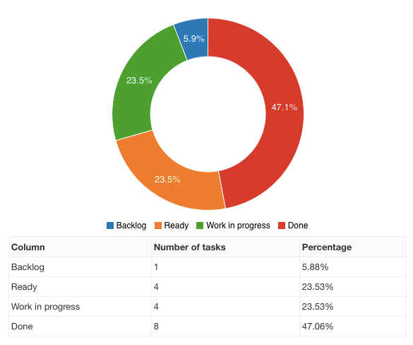
This pie chart provides an overview of the number of open tasks in each column.
Cumulative Flow Diagram
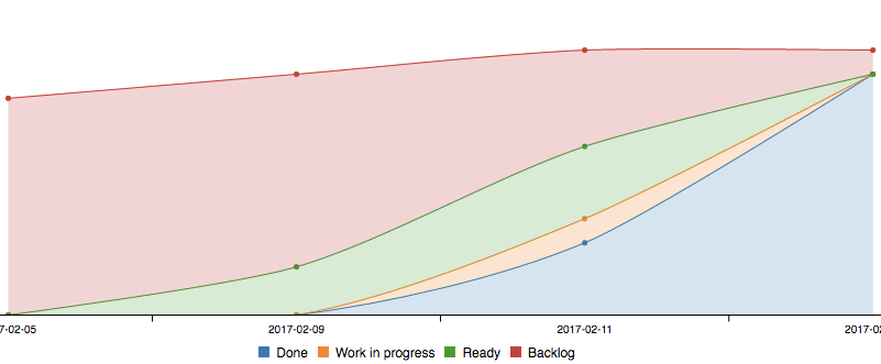
- This chart shows the cumulative number of tasks for each column over time.
- The legend order matches the stack order in the chart.
- The color of each column is determined automatically.
- Every day, the number of tasks is recorded for each column.
- To exclude closed tasks, change the global project settings.
Note: You need at least two days of data to view this graph.
Burn Down Chart
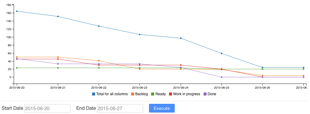
The burn down chart is available for each project.
- This chart is a graphical representation of work remaining versus time.
- Kanboard uses complexity or story points to generate this diagram.
- Every day, the sum of the story points for each column is calculated.
Average Time Spent in Each Column
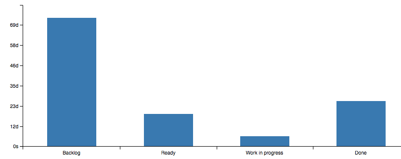
This chart shows the average time spent in each column for the last 1,000 tasks.
- Kanboard uses task transitions to calculate the data.
- The time spent is calculated until the task is closed.
Average Lead and Cycle Time
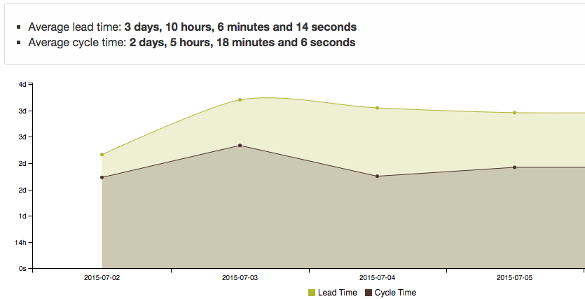
This chart shows the average lead and cycle time for the last 1,000 tasks over time.
- Lead time is the time between task creation and completion.
- Cycle time is the time between the specified start date of the task and its completion date.
- If the task is not closed, the current time is used instead of the completion date.
These metrics are calculated and recorded daily for the entire project.